Theme Research
Pure and Simple
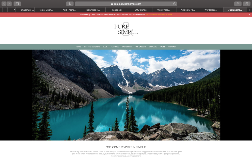
This theme is good because it showcases a simple theme, as is in the name. It is very easy to focus on what is important on the website because there is not a lot of activity. This theme is also good if you have a particularly breathtaking picture you want to showcase as your main theme. I would like to use the space for the big picture and the blog post down below.
This theme is not good if you have trouble reading small print, though the tabs at the top might be able to be adjusted. Some may also find this theme too simple because it only showcases one main photo and if they have more they wanted to show on the main page, they will not be able to show it at the top. I most likely will not use all of the tabs.
Trance
http://dinozoom.com/trance-free-wordpress-theme/
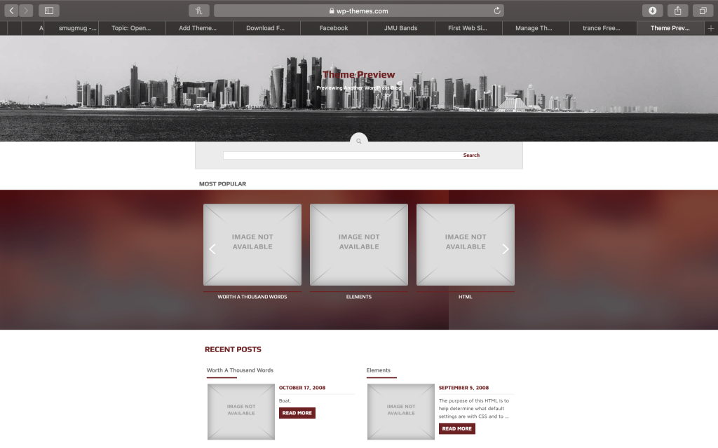
This theme is easily used to showcase one’s best photographs in a classy manner. It offers all of the navigation tools that a user could want on the homepage, including a search function, which is very useful to many people and could be used on my page to search around.
The theme however, will only showcase a really wide photo on the homepage so that can be limiting to me. It also showcases multiple blog like posts, so if I or the designer didn’t want them on the page, or didn’t have enough content, it might be difficult to fill.
Coral Parallax
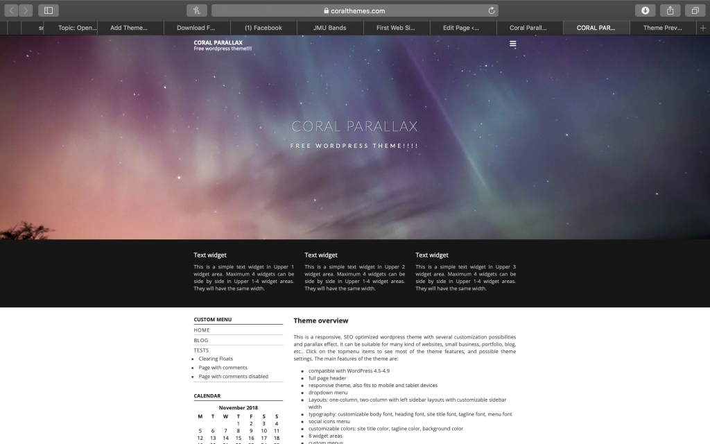
This theme is classy and edgy with its thin font and classy fade from picture to text. It also offers a calendar that is useful if the website includes events coming up as long as the picture behind the main text isn’t bold, the text in the center works well. I like the dark theme.
Some might have trouble with this theme because of the contrast between colors from black to white, but that can be changed. The text at the bottom can also be seen as crowded and unneeded information. The bottom may also be seen as plain compared to the top. I liked the calendar but I don’t have a use for it.
ColorMag
https://themegrill.com/themes/colormag/
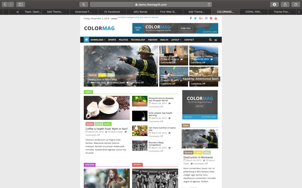
Colormag is great if you have a lot of content to put on a page. It has a lot of clickable links so that you can find out more and it is good for news websites that have a lot of content to post. It is also good for organizing a lot of content into categories where you can view everything which could be useful for the user assignments.
This theme is not good for people who gets overwhelmed with a lot of content. It also looks to be slightly cluttered, and if you don’t have enough content to fill it, it will make the page look awkward. It also has a lot of small text due to the small boxes that can be hard to read for the visually impaired. I don’t have a lot of content to post so a lot of the boxes will go unfilled.
Pleased
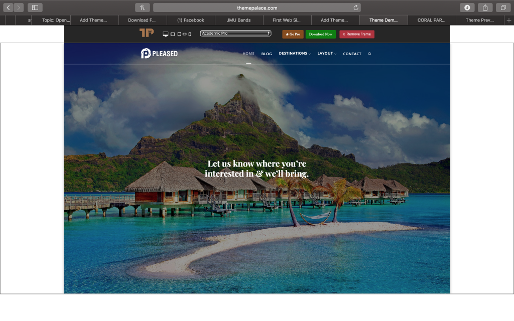
The Pleased theme provides an elegant layout that can showcase pictures as well as text content. It provides a place where you can showcase your best photos without cluttering the screen. The text over the main image is also clear to read and can be used as a simple welcome text. I also like how many tabs there are.
Some may not like the pleased theme if they didn’t want to showcase photos first, because the photos take up a lot of the room on the first part of the page. They also might not like the blog style to the page if it was going to be used professionally. This theme is not good to use in a store website because of the large photos as a header. I may not use all of the post functions of this site because there is a lot and it is mainly meant to be blogged on.
Ranking:
- Pure and Simple- Provides the blog-like style I am looking for without having too much, since I will not be posting multiple times. It also shows an appropriate amount of picture blocks because I will not be using this website as a photography website and I need to post content about myself. I like how simple the layout is because I don’t want to overwhelm anyone with too much content or buttons that they may not need to use.
- Pleased- A close alternative to Pure and Simple but it has too many tabs and buttons that I wouldn’t have a use for and the main picture may be too big.
- Coral Parallax- I like the top but the bottom is too simple and has too many functions I wouldn’t use.