
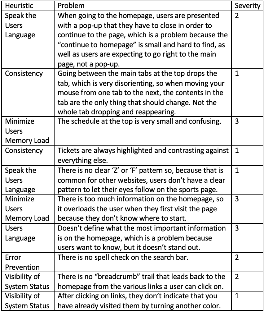
Heuristic Evaluation
I used Heuristic Evaluation to evaluate the JMU Sports website for issues.
Using a few of the heuristics, I was able to find multiple problems with the website that would fail the heuristic tests and would be placed on a severity rating high enough that the problems would need to be fixed. Two of the largest reoccurring heuristic problems that I saw was that a lot of the information was confusing because there was so much of it, so it has to ‘minimize the users memory load’, and some of the information and navigation was not clear so it did not ‘speak the users language’. Some of this could be fixed by simply choosing what was important to be on the page and finding another place for everything else. There are also some problems with ‘Consistency’, ‘Verification of System Status’, and ‘Error Prevention’ Below I have listed the problems and their categorization as well as their severity rating and my suggestions for a solution.
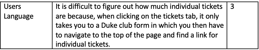
I evaluated the sports website because I was thinking about buying tickets for a friend in the future, so I decided to figure out how to navigate the website. I first looked at the main page and was overwhelmed by the amount of information on it. There were lots of picture/video thumbnails with long descriptions everywhere, but I felt that the most important thing on the page was the schedule, which was at the very top. The schedule was small, and it was very cluttered and unclear. My first impression was that it was for football but upon closer inspection, it had every sport lined up and none of the dates I had looked at were for football. Since I was looking to possibly buy tickets in the future, I clicked on the tickets tab (which was highlighted a different color) and tried to find individual ticket prices. The link took me to a duke club ticket donation page, in which you had to look at multiple links at the top to find individual tickets before it would show individual ticket prices. Throughout this search, I also tested out the ‘Visibility of System Status’ and ‘Error Prevention’ Heuristics and found a few problems within the navigation route.
My methods for checking out the website was to test out places I would want to go to and look for heuristic errors there by running down each one. The heuristics I found were:
- Visibility of System Status
- Speak the Users Language
- Minimize Users Memory Load
- Consistency
- Error prevention
I looked at the schedule, the tickets, the search function, and the overall design and layout.
This table lists each problem, as well as each heuristic that matches the problem. The table also includes a severity rating which, on a scale of 0-4, determines how important it is that the problem be fixed. 0- no problem, 1- cosmetic issues, 2- minor usability issues, 3- major usability issues, important to fix, 4- usability catastrophe, imperative to fix.
This website mostly has problems with its design, with a few minor problems with its functions.
-The problem with the pop-up is that people aren’t expecting to see it, they are expecting to go right to the homepage, and also the link to the homepage is slightly hard to find. The pop-up is just a countdown until the next football game, so they should have it at the top of the main homepage instead.
– Going down the page, the main navigation tabs at the top drop down every time you hover over them, and disappear whenever you are between tabs, which is disorienting when they are disappearing and reappearing all the time, so they should all stay open when you hover over one, but the contents will change when you move to another tab.
– The schedule at the top is very small and confusing so going along with some of the other problems, such as, there is too much information on the page, it doesn’t define what the most important information is, and there is no clear ‘Z’ or ‘F’ pattern, the schedule is probably the most important thing the sports homepage has to offer so it should be bigger and clearer. The page needs to minimize all of its thumbnails and pick the most enticing ones that could lead a user to another page where more links will be. When the page is minimalistic, it will be easier to place everything into a clear pattern.
– Tickets are always highlighted, which is a little confusing to the aesthetic appearance. As a user who mostly wants to find tickets, I understand that it is there to help you find it, but the sports page also has a lot more to offer and not everyone is looking for tickets, so it can be disorienting if it isn’t the same color as the rest of the tabs.
– With searching for individual tickets, clicking on the tickets tab should take the user directly to a purchase page with the price on them, rather than a Duke Club form that won’t make sense to anyone but who is in the club.
-There is no spellcheck on the search bar which will severely limit a search even if the user knows that the link exists, so there should be spelling suggestions offered.
– There should be a “breadcrumb trail” that shows users where they have been, as well as how to get back to the home page.
– After clicking on links, they should turn another color to indicate that the user has already clicked on it before.
Reference